
Creating a candlestick chart in Google Slides might sound like a tricky task, but it’s actually pretty simple once you know the steps. Candlestick charts are a great way to visualize financial data, especially when you’re analyzing trends like stock prices or market performance.
While Google Slides isn’t a dedicated tool for making these charts, with a little creativity, you can design a clear and professional-looking candlestick chart directly in your presentation.
Whether you’re preparing a pitch, delivering a financial report, or just exploring data visualization techniques, learning how to make a candlestick chart in Google Slides can be a useful skill.
You can also explore how to make a title page or create summary slides to make your entire presentation more impactful.
Let’s dive into this straightforward guide to help you get started.
How to Create a Candlestick Chart in Google Slides?
Creating a candlestick chart in Google Slides involves two main steps: first, making the chart in Google Sheets, and then adding it to your slide. Here’s a step-by-step guide to walk you through the process.
Step 1: Create a Candlestick Chart in Google Sheets
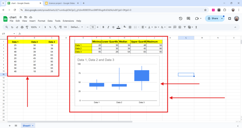
To start, you need to prepare your data in Google Sheets. Begin by organizing your information into a table. The table should have five columns labeled: Minimum, Lower Quartile, Median, Upper Quartile, and Maximum. These columns represent the main data points needed to create a candlestick chart.
Once your data is ready, highlight the entire range of data, including the column headers. After that, go to the Insert tab at the top of Google Sheets and select Chart from the options. This will automatically generate a chart based on your data.
Next, a chart editor will appear on the right-hand side of the screen. In the chart editor, you will see a dropdown menu labeled Chart type. Click on it, scroll down the list of chart types, and choose Candlestick chart.
This will change the chart to a candlestick format. You can then customize the chart to suit your needs by adjusting things like the colors, labels, and other visual details.
<SlidesAICTA1 />
Step 2: Add the Candlestick Chart to Google Slides
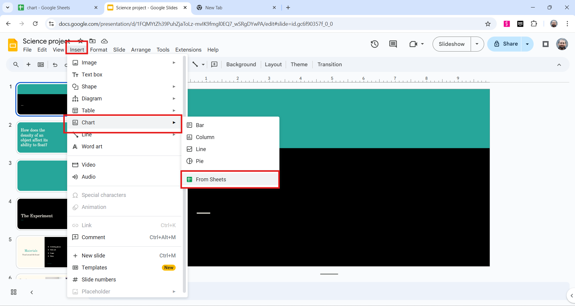
Once your candlestick chart is ready in Google Sheets, the next step is to insert it into your Google Slides presentation. Open the Google Slides file where you want to place the chart. Click on the slide where you’d like the chart to appear.
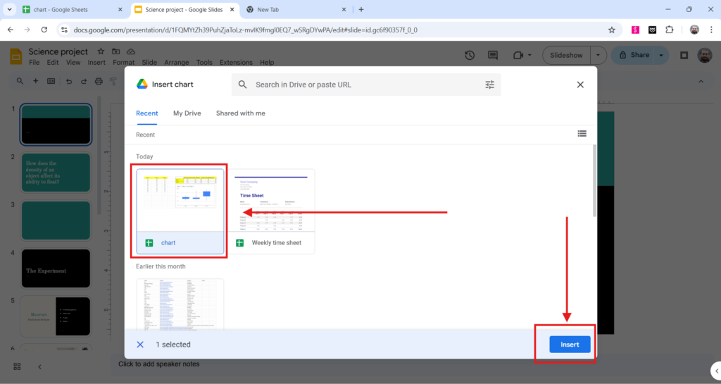
In Google Slides, click on Insert in the top menu, then choose Chart and select From Sheets. A window will pop up showing all the Google Sheets files stored in your Google Drive. From here, select the sheet that contains the candlestick chart you created earlier. After selecting the correct sheet, click Insert.
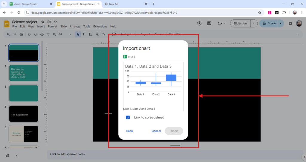
If the sheet contains multiple charts, a prompt will appear asking you to choose the specific chart you want to insert. Once you make your selection, the chart will be added to your slide.
Closing Thoughts
That’s it! With these simple steps, your candlestick chart is now part of your Google Slides presentation, ready to be displayed in your next presentation or report. Experiment with it’s style and use the one that fits best for your theme.
<SlidesAICTA2 />
Read more:
- How to Create an Organizational Chart in Google Slides?
- How to Make a Flow Chart in Google Slides?
- How to Make a Venn Diagram on Google Slides?
- How to Make a Pie Chart in Google Slides?
Frequently Asked Questions
1. What exactly is a candlestick chart, and why is it important?
A candlestick chart is a way to show price movements of an asset over time. It’s commonly used in trading to help analyze trends by displaying the opening, highest, lowest, and closing prices for each time period.
2. Can I make a candlestick chart in Google Slides?
Google Slides doesn’t have a built-in tool for candlestick charts. However, you can create one by hand using shapes and lines, or you can import one from Google Sheets.
3. Can I change the colors and styles of the candlesticks in Google Slides?
If you’re creating the chart yourself in Google Slides or importing it as an image, you can adjust the colors, styles, and labels to fit your needs. For charts linked from Google Sheets, any changes need to be made in Sheets itself.
Related Posts
-

Learn to create a detailed organizational chart in Google Slides with step-by-step instructions. Explore three…
-

Data visualization is a helpful way to make complex statistics easier to understand. Including pie…
-

Want to make your presentations more engaging and easier to understand? Adding flowcharts is a…
-

Working with multiple slides at once in Google Slides can save you a lot of…
-

{ “@context”: “https://schema.org”, “@type”: “FAQPage”, “mainEntity”: [{ “@type”: “Question”, “name”: “Why should I time my…