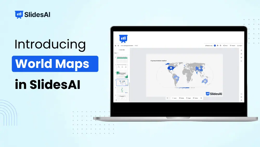
Turn country-level data into a visual you can understand at a glance.
Country-level data can tell you what is happening. A map can help you see where it’s happening.
Whether you’re working with sales figures, website traffic, customer data, market size, or research findings, putting everything into a table can make geographic patterns difficult to spot.
With World Map charts in SlidesAI, you can turn country-level data into a visual map directly inside your presentation.
Choose how you want to display the data, add labels and values, highlight specific locations, and explore the map while presenting.
What Can You Do With World Map Charts?
World Map charts connect your data to specific countries so you can visualize results geographically.
You can use them to show:
- Sales or revenue by country
- Customers by location
- Website traffic
- Market size
- Regional performance
- Survey results
- Global operations
- Research data
- International growth
For example, if you have sales data for 20 countries, you can turn that list into a map and quickly see where your strongest markets are.
Choose How You Display Your Data
You can choose between two visualization styles:
- Shaded countries: Countries are shown using different shades based on their values.
- Bubbles: Bubbles appear over countries, with their size representing the value.
Shaded maps are useful for seeing broad geographic patterns, while bubbles can make individual markets or locations stand out.
How to Create a World Map Chart in SlidesAI?
Creating a World Map chart takes just a few steps.
Step 1: Add a World Map Chart
Open the presentation you’re working on and add a new chart. From the chart options, select World Map.
Step 2: Add Your Country Data
Enter your country names or country codes along with the values you want to display.
For example:
| Country | Revenue |
|---|---|
| United States | $2.4M |
| Germany | $1.6M |
| India | $1.2M |
| Japan | $950K |
| Brazil | $620K |
SlidesAI uses this information to place your data on the appropriate countries.
Step 3: Choose a Map Style
Choose the style that best fits what you want your audience to notice.
Shaded countries work well when you’re comparing many countries or showing broad geographic patterns.
Bubbles work well when you want individual markets or locations to stand out.
You can switch between the two styles while working on the chart.
Step 4: Add the Details Your Audience Needs
You can add:
- Country names
- Values
- Legends
- Annotations
You don’t have to display everything. If the map is already busy, keep the labels limited to the information your audience actually needs.
Step 5: Adjust the Map
Use the map controls to:
- Zoom in
- Zoom out
- Pan around the map
- Fit the map to your data
- Reset the view
This is useful when you’re working with a specific region and want to take a closer look.
Step 6: Present Your Map
The map controls are also available in full-screen Present mode.
For example, you can start with a view of the entire world and then zoom into Asia while discussing your company’s growth in the region.
Any navigation you make while presenting is temporary and does not change the saved version of your slide.
Choose the Right Map Style
Not sure whether to use shaded countries or bubbles? Think about what you want your audience to notice.
Use shaded countries when:
- You’re comparing many countries
- You want to show broad geographic patterns
- You’re looking at regional or global trends
- Overall distribution matters more than individual values
Use bubbles when:
- You want specific markets to stand out
- You’re comparing individual locations
- The size of each value matters
- You want to highlight major markets visually
There’s no need to stick with your first choice. Try both and see which one makes your data easier to understand.
Why Use a World Map Instead of a Table?
Tables are useful when your audience needs to read exact numbers.
Maps are useful when you want people to notice a geographic pattern.
For example, a table might tell you that your company has customers in 25 countries. A map can show you where those 25 countries are.
That difference matters during a presentation. Your audience can see whether activity is concentrated in one region, spread across several continents, or growing in a particular part of the world without scanning through a long list of countries.
You can still include the numbers. The map simply gives those numbers some context.
Make Your World Map Easier to Read
A map can become difficult to understand if you try to put too much information on it.
Keep these things in mind:
- Don’t label every country unless you need to. Too many labels can make the map crowded.
- Use a clear legend. Your audience should understand what the colors or bubbles mean.
- Highlight important data. If one market matters more than the others, make it easy to spot.
- Keep the title specific. Instead of “Global Sales,” try “2026 Revenue by Country.”
- Use annotations sparingly. A few useful callouts are better than covering the map with notes.
The map should help people understand the data, not become another thing they have to decode.
Where Can You Use a World Map Chart?
- Sales Presentations: Show revenue, sales, customers, or growth across different countries.
- Marketing Reports: Show where website visitors, leads, downloads, or customers are coming from and make geographic patterns easier to spot.
- Research Presentations: Show how findings vary across countries and add values or labels when your audience needs the actual numbers.
- Global Business Updates: Show offices, markets, customers, suppliers, or other locations around the world.
- Education and Academic Presentations: Visualize population data, economic statistics, environmental research, historical information, or other country-level datasets.
Frequently Asked Questions
Can I add country names and values?
Yes. You can display country names, values, legends, and annotations on World Map charts.
Can I use country codes instead of full country names?
Yes. World Map charts can use country names or country codes alongside their values.
Can I change the map style?
Yes. You can choose between shaded-country and bubble-based visualizations.
Can I zoom into a specific region?
Yes. You can zoom, pan, fit the map to your data, and reset the view in the editor and Present mode.
Does zooming change my saved slide?
No. Navigation in Present mode is temporary and does not change the saved map.
Can I use a World Map chart for a business presentation?
Yes. You can use it for sales, revenue, customers, market data, regional performance, and other geographic business information.
Turn Your Geographic Data Into a Slide
World Map charts give you a simple way to bring geographic data into your presentations.
Instead of keeping country-level numbers in a table or creating a map somewhere else, you can build the visual directly in SlidesAI. Choose between shaded countries and bubbles, add the labels and values you need, and highlight the locations that matter.
You can continue editing the map in your presentation as your data or story evolves.
<SlidesAICTAWeb />
Related Posts
-

A presentation isn’t only about what appears on the screen. It’s also about when your…
-

How do I cancel my SlidesAI Subscription? You can cancel your subscription from Your Account…
-

SlidesAI is a Google Workspace Add-on (think of it like a Chrome Extension but only…
-

Instead of building presentations from scratch, teams can now create polished board deck presentations much…
-

Creating a quarterly business review means spending hours on editing charts, rewriting summaries, and fixing…