Key Takeaways
- The right font defines how your audience reads, feels, and connects with your presentation.
- Sans-serif fonts like Arial, Roboto, and Open Sans offer clarity and modern appeal.
- Serif fonts such as Georgia and Lora add elegance and professionalism to formal decks.
- Use bold, high-contrast fonts for headings and simple, legible fonts for body text.
- Limit yourself to two font families per presentation to maintain consistency.
- Smart font pairings like Montserrat + Open Sans or Playfair Display + Source Sans Pro ensure balanced design.
- Match your font choice to your industry and audience for maximum impact.
- Always check contrast, size, and readability across different devices.
- SlidesAI simplifies design by automatically selecting and applying the best presentation-ready fonts, saving time while keeping your slides professional.
The right font can impress or disappoint the people viewing your presentation. It’s more than just a design choice; the font decides how your audience reads, feels, and remembers your message. A poorly chosen font can distract your audience, confuse them, and even make your slides look unprofessional. In contrast, the best fonts for presentations create a smooth flow of information, helping your ideas stand out effortlessly.
Readability, tone, and professionalism all come down to the way the information is written. A well-balanced font improves comprehension and conveys your message with confidence, whether you’re an educator simplifying concepts, a marketer pitching a new campaign, or a student presenting research. Let’s explore the 30 best fonts for presentation slides that combine clarity, style, and impact.
Best Fonts for Presentation Slides
The best fonts for presentation slides are generally clear, sans-serif fonts like Arial, Calibri, Helvetica, and Lato for their readability on screens. For a more formal or modern look, consider serif fonts like Georgia or Palatino, or modern sans-serif options like Montserrat and Roboto.
| Font | Typeface | Styles | Languages supported | About |
| Arial | Sans-serif | 2 | 67 | Humanist sans; softer curves and diagonal terminals; widely used for reports, presentations, display. |
| Calibri | Sans-serif | 2 | 67 | Default MS typeface era; balanced spacing; professional tone. Calibri is a versatile font best used for professional documents, educational materials, digital signage, and personal use. It has a clean and modern design, coupled with excellent readability. |
| Helvetica | Sans-serif | 8 | 37 | Clear, modern classic; Helvetica is a widely used sans-serif typeface known for its clean, simple, and modern appearance, making it a popular choice for various design projects, including signage, branding, advertising, |
| Verdana | Sans-serif | 4 | 69 | Screen-friendly spacing; designed for on-screen clarity. |
| Roboto | Sans-serif (Variable available) | 2 | 71 | Very common digital font; variable. While some grotesks distort their letterforms to force a rigid rhythm, Roboto doesn’t compromise, allowing letters to be settled into their natural width. This makes for a more natural reading. |
| Open Sans | Sans-serif | 2 | 73 | Optimized for print, web, and mobile interfaces, offers excellent legibility and letterforms. |
| Lato | Sans-serif | 18 | 79 | Classic proportions, especially noticeable in the uppercase. semi-circular details of the letters give Lato a sense of warmth, while the solid structure provides stability and seriousness. |
| Montserrat | Sans-serif | 18 | 73 | Inspired by Buenos Aires signage, widely used, open-source. |
| Inter | Sans-serif (variable) | 19 | 79 | Carefully crafted & designed for computer screens. Inter features a tall x-height to aid in the readability of mixed-case and lower-case text. |
| Noto Sans | Sans-serif | 4 | 82 | a family of sans-serif typefaces consisting of over 100 independent fonts designed for all scripts represented in the Unicode system. |
| Fira Sans | Sans-serif | 18 | 79 | The Fira typeface was developed for integration with the Mozilla FirefoxOS operating system and was designed to improve readability on mobile phones with varying screen quality and rendering. |
| Source Sans Pro | Sans-serif | 12 | 73 | Known for its clean and modern design, it is a versatile font that can be used for a variety of purposes. Its design features make it a great choice for web and print projects, such as logos, headlines, and body text. |
| Avenir (tag page) | Sans-serif | 22 | More than 150 | Celebrated for its clean, modern look, Avenir blends precise geometric forms with organic curves, making it highly versatile for both display and body text. |
| Tahoma | Sans-serif | 1 | 87 | While similar to Verdana, Tahoma has a narrower body, smaller counters, much tighter letter spacing, and a more complete Unicode character set. |
| Trebuchet MS | Sans-serif | 1 | 66 | Trebuchet is well-suited for use in extended texts, User Interface scenarios, and spreadsheet design, given the font’s narrow letterforms. Trebuchet works brilliantly on the screen and has become a classic choice for Web page design. |
| Raleway | Sans-serif (Variable) | 20 | 73 | Elegant geometric sans; expanded family over time. aims for a minimalist aesthetic and clean look and can be used in commercial and non-commercial use. |
| Nunito | Sans-serif | 14 | 74 | known for its smooth, rounded design and variety of weights. It offers a modern look that works well in different media |
| Quicksand | Sans-serif | 5 | 63 | Quicksand is a sans serif font that has become a popular choice for designers everywhere due to its friendly and approachable look. These features make it a versatile option for both display and small text. It is suitable for everything from websites to print materials |
| Poppins | Sans-serif | 20 | 57 | It is a geometric sans serif font, with influences from both humanist and grotesque typefaces. Its design features include slightly rounded corners, a tall x-height, and an open aperture. The font is known for its legibility and versatility, making it suitable for a wide range of projects. |
| League Spartan | Sans-serif | 1 | 50 | Focusses on clean lines and geometric shapes, the font achieves a timeless quality. This approach makes League Spartan a reliable choice for projects demanding a strong visual presence without unnecessary embellishments. |
| Archivo Black | Sans-serif | 1 | 59 | Designed to be used simultaneously in print and digital platforms. The technical and aesthetic characteristics of the font are both crafted for high-performance typography. |
| Playfair Display | Serif | 2 | 68 | High-contrast serif for elegant headings; |
| Libre Baskerville | Serif | 3 | 61 | The font can be used in commercial and non-commercial use. It is web-optimized |
| Lora | Serif (Variable) | 2 | 68 | Modern text serif with calligraphic roots; optimized for screen/print. |
| Merriweather | Serif | 8 | 72 | High x-height; designed for comfortable reading on screens; has matching Sans. |
| Georgia | Serif | 4 | 67 | Screen-oriented transitional serif; The Georgia typeface is similar to Times New Roman, its bold is also unusually bold, almost black. It was designed for clarity on a computer monitor, even at small sizes |
| Franklin Gothic (Demi) | Sans-serif | 1 | 66 | Bold and classic Franklin Gothic has been used in many advertisements and headlines in newspapers. The typeface continues to maintain a high profile, appearing in a variety of media from books to billboards. |
| Dosis | Sans-serif (Variable) | 1 | 59 | Rounded, minimalist sans; open-source. known for its rounded corners and geometric design. The style is warm and approachable, which makes it a favorite in creative projects |
| Muli | Serif | 10 | 59 | Lightweight, neutral sans; open-source licensing. Designed mainly for use as a display font, but is usable as a text font too. |
| Baskerville | Serif | 5 | 39 | Compared to earlier designs popular in Britain, Baskerville increased the contrast between thick and thin strokes, making the serifs sharper and more tapered, and shifted the axis of rounded letters to a more vertical position. The curved strokes are more circular in shape. |
-
Arial
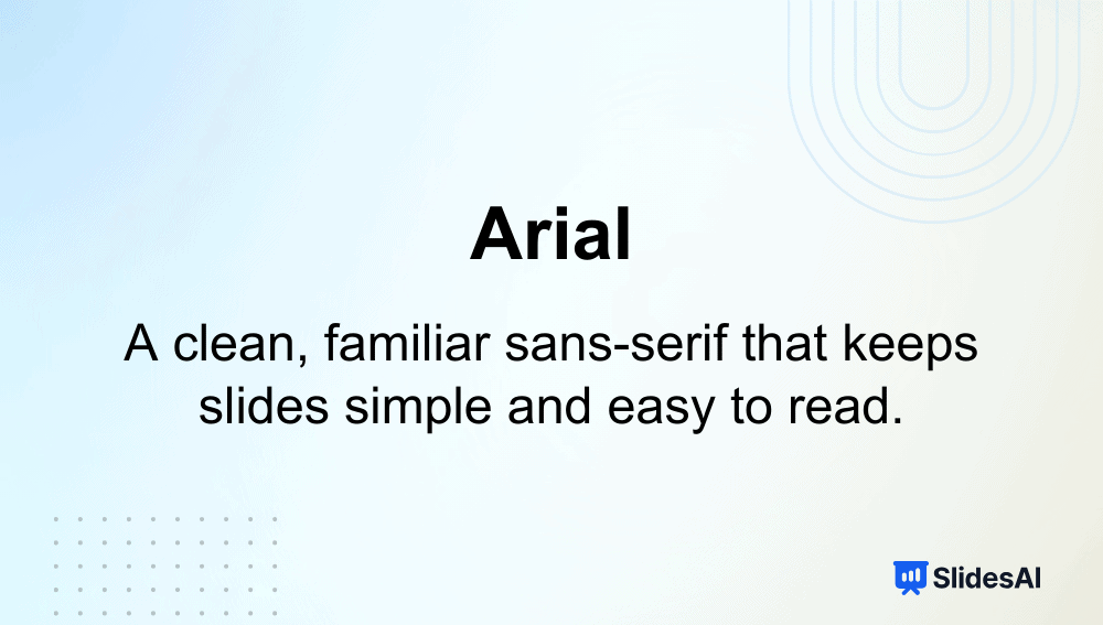
Intro: Arial is a universally recognized sans-serif font that delivers simplicity and clarity across digital and printed platforms.
Why it’s among the best fonts for presentations:
- Extremely legible at any size, making it perfect for text-heavy slides.
- Widely supported across all operating systems and devices.
- Maintains a professional yet approachable tone.
Typeface: Sans-serif
-
Calibri
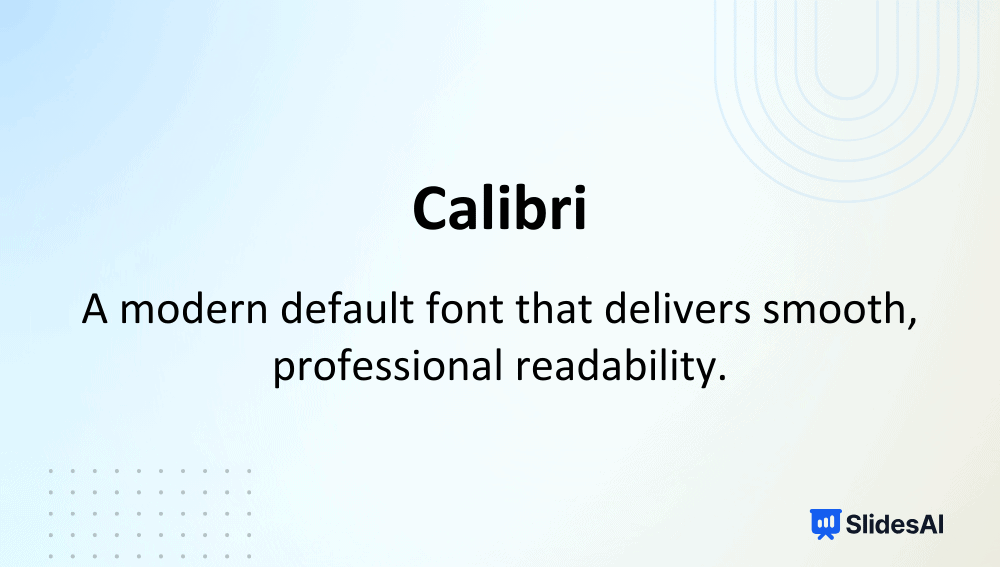
Intro: Designed for Microsoft, Calibri replaced Times New Roman as the Office default for over a decade, known for its warm, modern appearance.
Why it’s among the best fonts for presentations:
- Balanced letter spacing improves on-screen readability.
- Versatile and works well in professional and educational decks.
- Provides a clean look that keeps slides neat and cohesive.
Typeface: Sans-serif
-
Helvetica

Intro: Helvetica is one of the most famous sans-serif fonts, celebrated for its minimalism and modernity.
Why it’s among the best fonts for presentations:
- Highly readable even at small text sizes.
- Clean lines give slides a timeless, professional feel.
- Works exceptionally well for branding or formal presentations.
Typeface: Sans-serif
-
Verdana
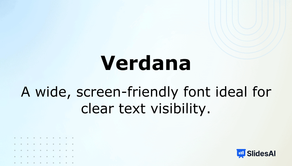
Intro: Designed by Matthew Carter for on-screen use, Verdana offers excellent clarity on monitors and projectors.
Why it’s among the best fonts for presentations:
- Wide letter spacing enhances visibility from a distance.
- Works well for long paragraphs or detailed slides.
- Optimized for digital screens, ensuring crisp edges.
Typeface: Sans-serif
-
Roboto
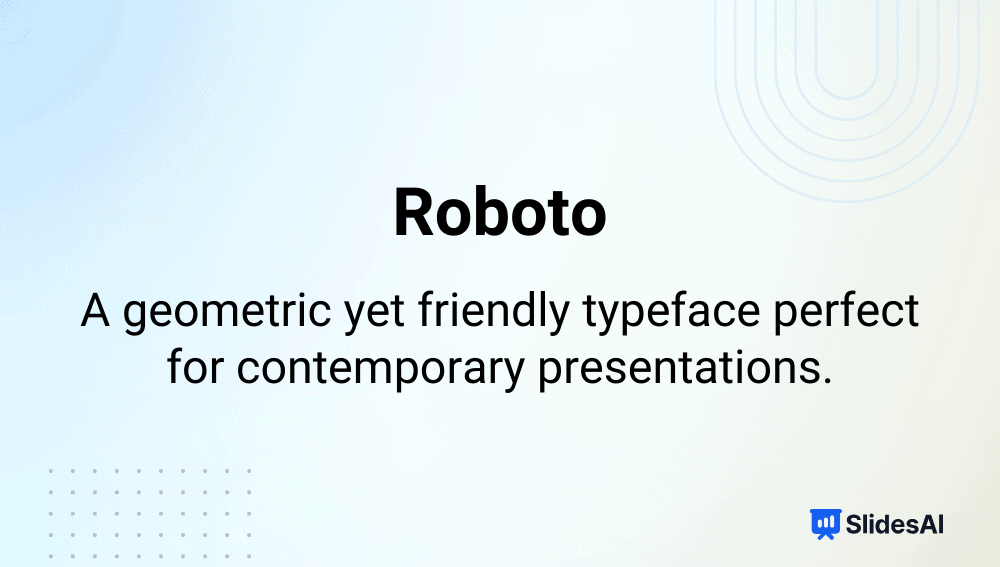
Intro: Roboto, Google’s signature font, combines mechanical structure with open, friendly curves.
Why it’s among the best fonts for presentations:
- Designed for natural reading flow across digital devices.
- Pairs well with multiple modern fonts like Poppins or Open Sans.
- Offers geometric precision without feeling rigid.
Typeface: Sans-serif (Variable)
-
Open Sans
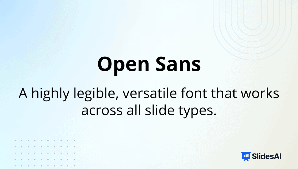
Intro: Created for easy readability on web and mobile interfaces, Open Sans is a balanced, humanist typeface.
Why it’s among the best fonts for presentations:
- Offers excellent legibility even with dense content.
- Works seamlessly across digital platforms.
- Neutral tone complements both casual and corporate designs.
Typeface: Sans-serif
-
Lato
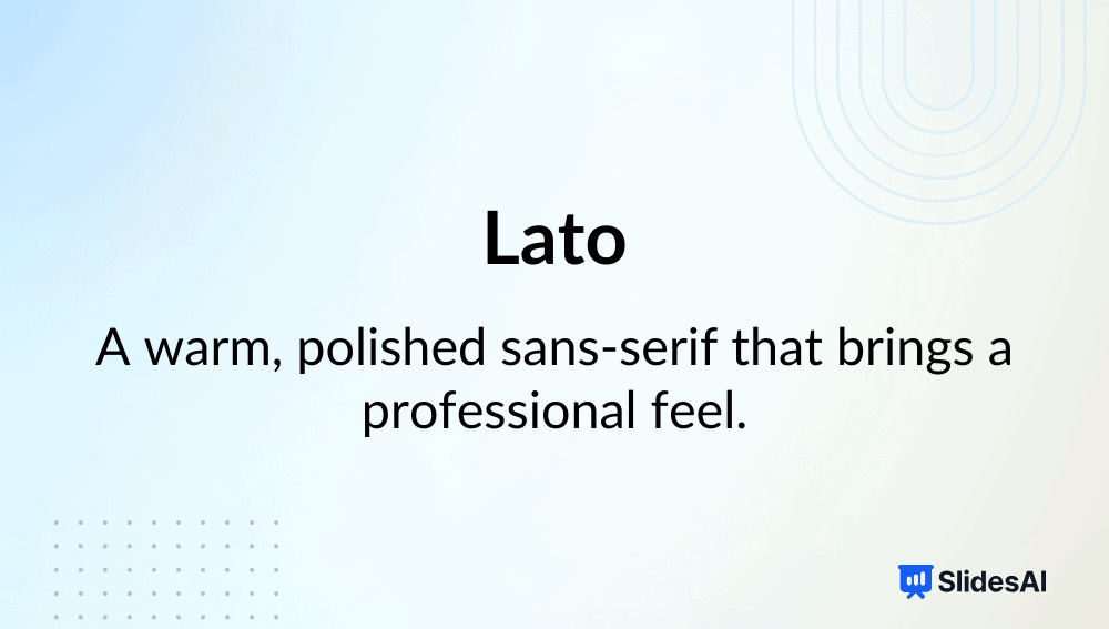
Intro: Designed by Łukasz Dziedzic, Lato bridges professionalism and warmth through subtle, rounded details.
Why it’s among the best fonts for presentations:
- Maintains visual balance for large chunks of text.
- Works for academic and marketing slides alike.
- Offers multiple weights for a clear hierarchy.
Typeface: Sans-serif
-
Montserrat
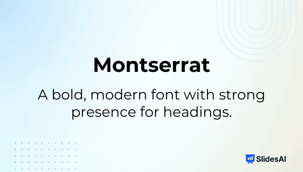
Intro: Inspired by urban typography from Buenos Aires, Montserrat is known for its bold, geometric form.
Why it’s among the best fonts for presentations:
- Perfect for headings and large titles.
- Modern, versatile, and ideal for minimal slide designs.
- Highly readable even in bold weights.
Typeface: Sans-serif
-
Inter
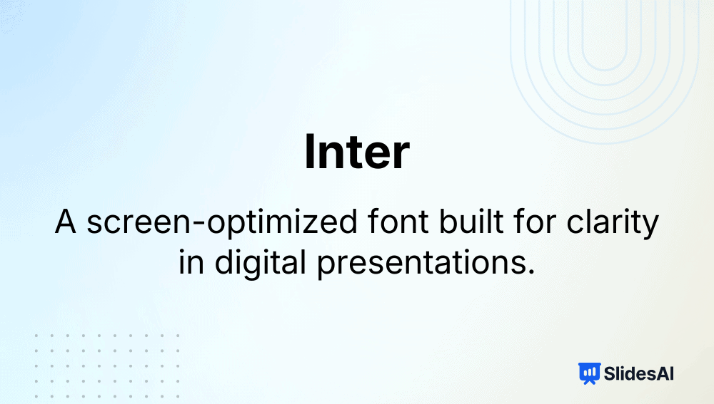
Intro: Designed for digital environments, Inter is optimized for screen legibility with a tall x-height.
Why it’s among the best fonts for presentations:
- Extremely clear on monitors and projectors.
- Excellent for data or text-heavy educational slides.
- Works well for body text in modern, flat designs.
Typeface: Sans-serif (Variable)
-
Noto Sans

Intro: Part of Google’s global Noto font family, designed to support over 100 languages.
Why it’s among the best fonts for presentations:
- Ensures uniform typography in multilingual slides.
- Consistent line height and character clarity.
- Ideal for global classrooms or international businesses.
Typeface: Sans-serif
-
Fira Sans

Intro: Developed for Mozilla, Fira Sans focuses on screen readability and clean user interface presentation.
Why it’s among the best fonts for presentations:
- Optimized for different screen resolutions.
- Retains legibility in data charts or bullet-heavy decks.
- Balanced style suits both tech and education slides.
Typeface: Sans-serif
-
Source Sans Pro
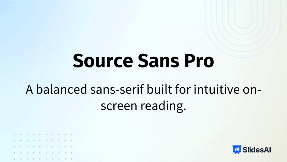
Intro: Adobe’s first open-source typeface, Source Sans Pro, combines elegance with utility.
Why it’s among the best fonts for presentations:
- Works equally well for headings and paragraphs.
- Keeps text compact and readable for longer decks.
- Great for consistent branding across digital materials.
Typeface: Sans-serif
-
Avenir
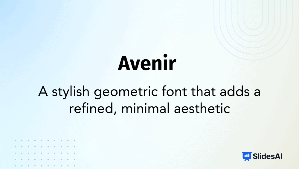
Intro: Created by Adrian Frutiger, Avenir is known for its timeless geometry and humanist warmth.
Why it’s among the best fonts for presentations:
- Creates a polished, contemporary look.
- Easy to pair with serif fonts for contrast.
- Great for corporate and creative decks alike.
Typeface: Sans-serif
-
Tahoma
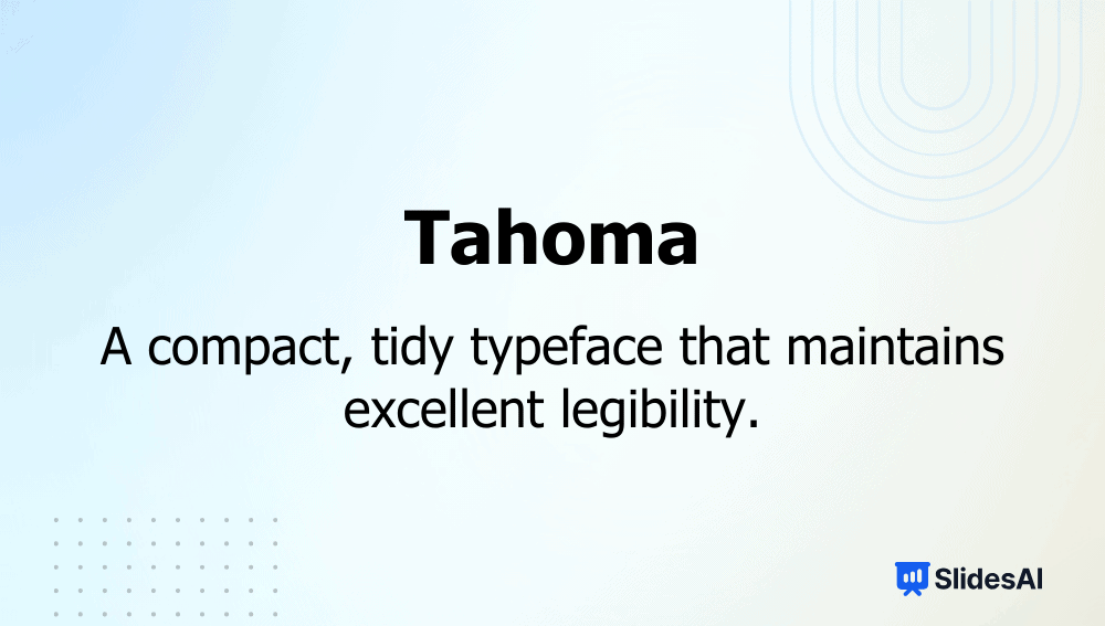
Intro: Designed by Matthew Carter, Tahoma is a reliable system font with tight letter spacing.
Why it’s among the best fonts for presentations:
- Perfect for compact slides or tables.
- Excellent clarity across all screen types.
- Professional yet unobtrusive tone.
Typeface: Sans-serif
-
Trebuchet MS
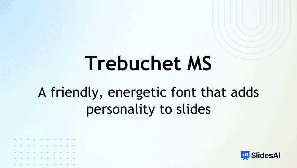
Intro: A Microsoft classic, Trebuchet MS is known for its friendly, readable design.
Why it’s among the best fonts for presentations:
- Works brilliantly for both headers and body text.
- Easy to read in UI and long text blocks.
- Adds subtle character without losing formality.
Typeface: Sans-serif
-
Raleway
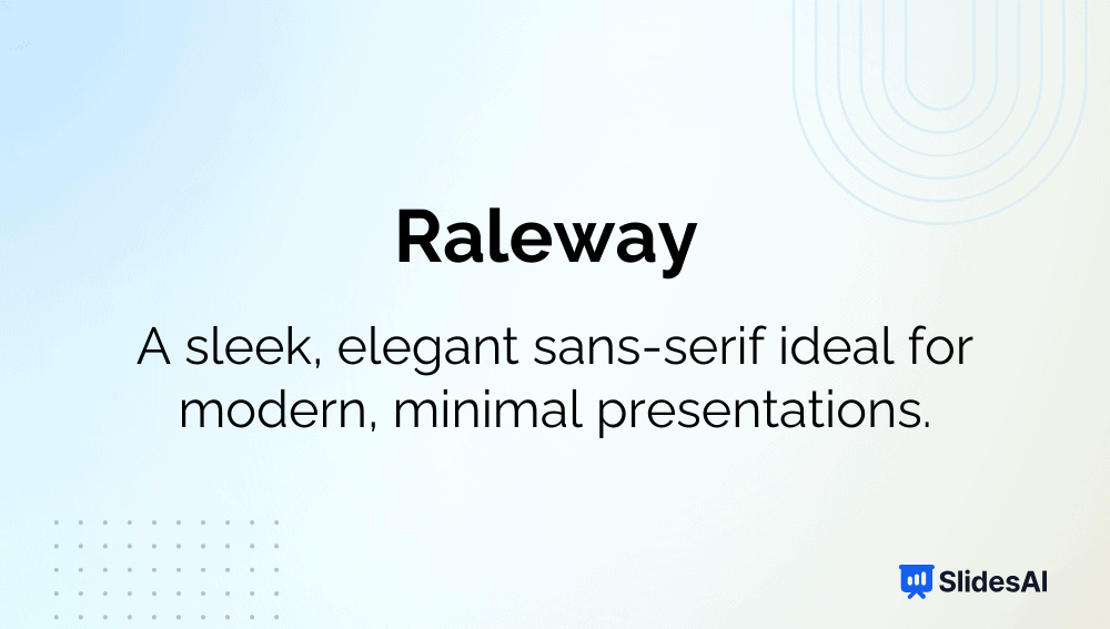
Intro: Raleway is a sleek, modern sans-serif font ideal for striking titles.
Why it’s among the best fonts for presentations:
- Delivers a minimalist aesthetic perfect for creative decks.
- Lightweight structure keeps slides airy.
- Ideal for professional and non-commercial use.
Typeface: Sans-serif (Variable)
-
Nunito
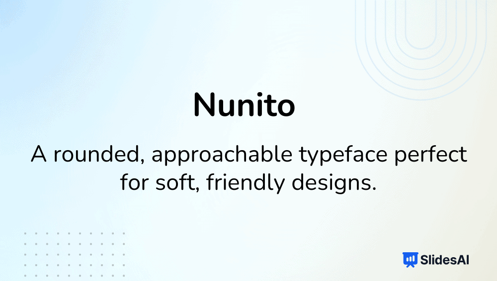
Intro: Nunito’s smooth, rounded forms give it a welcoming, modern personality.
Why it’s among the best fonts for presentations:
- Balances friendly curves with high readability.
- Great for health, education, or non-profit themes.
- Works across different devices seamlessly.
Typeface: Sans-serif
-
Quicksand
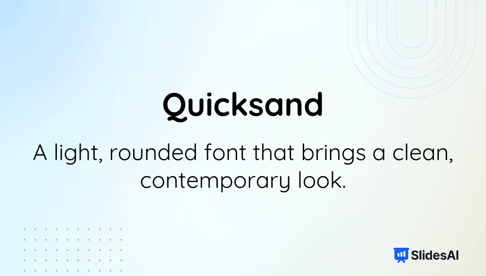
Intro: A geometric sans-serif font known for its friendly, open shapes.
Why it’s among the best fonts for presentations:
- Clean structure enhances short headings.
- Adds warmth and approachability to slides.
- Perfect for design, youth, or event decks.
Typeface: Sans-serif
-
Poppins
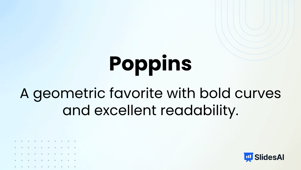
Intro: A geometric sans-serif font with humanist influences and slightly rounded edges.
Why it’s among the best fonts for presentations:
- Maintains legibility across headings and paragraphs.
- Balanced proportions enhance presentation hierarchy.
- Excellent choice for marketing and startup decks.
Typeface: Sans-serif
-
League Spartan
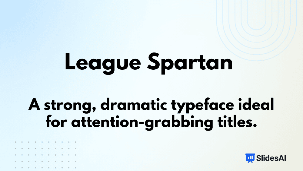
Intro: League Spartan is a bold, geometric sans-serif known for its powerful presence.
Why it’s among the best fonts for presentations:
- Dominates attention on title slides.
- Clean lines project strength and professionalism.
- Great for business or product launch decks.
Typeface: Sans-serif
-
Archivo Black

Intro: A bold, high-performance sans-serif font designed for both print and digital media.
Why it’s among the best fonts for presentations:
- Excellent for impactful headings or data visuals.
- Maintains clarity even at large sizes.
- Versatile for advertising and educational use.
Typeface: Sans-serif
-
Playfair Display
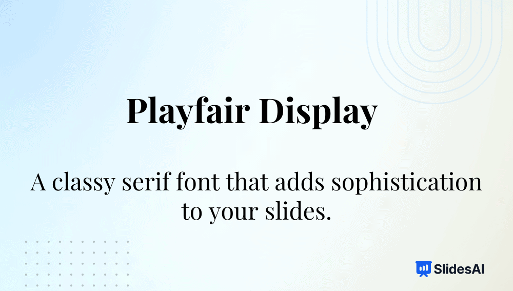
Intro: A transitional serif font known for its elegant, high-contrast design.
Why it’s among the best fonts for presentations:
- Adds a refined, premium look to headings.
- Ideal for artistic or academic decks.
- Pairs beautifully with minimalist sans-serif fonts.
Typeface: Serif
-
Libre Baskerville
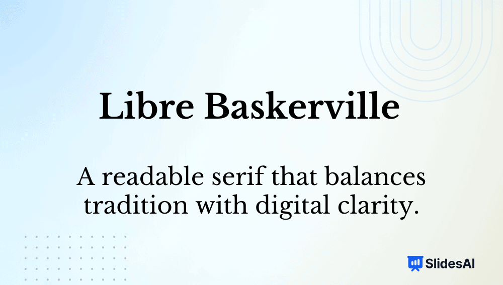
Intro: A web-optimized serif font inspired by Baskerville’s 18th-century design.
Why it’s among the best fonts for presentations:
- Timeless, readable, and professional.
- Excellent for long-form text or scholarly content.
- Retains elegance on digital screens.
Typeface: Serif
-
Lora
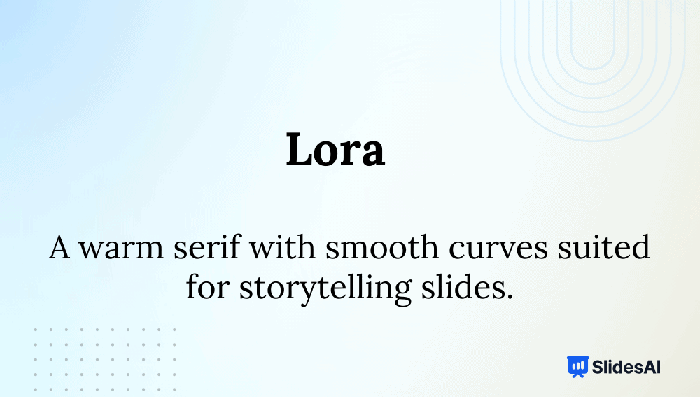
Intro: Lora is a modern serif with roots in calligraphy, combining classic beauty and readability.
Why it’s among the best fonts for presentations:
- Suitable for storytelling and educational content.
- Great contrast between thick and thin strokes.
- Readable on both digital and print slides.
Typeface: Serif (Variable)
-
Merriweather
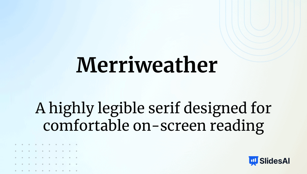
Intro: Designed for screen comfort, Merriweather has a slightly condensed, traditional serif form.
Why it’s among the best fonts for presentations:
- Clear and readable for dense data or reports.
- Has a Sans version for cohesive pairing.
- Warm tone suits academic or editorial decks.
Typeface: Serif (Variable)
-
Georgia
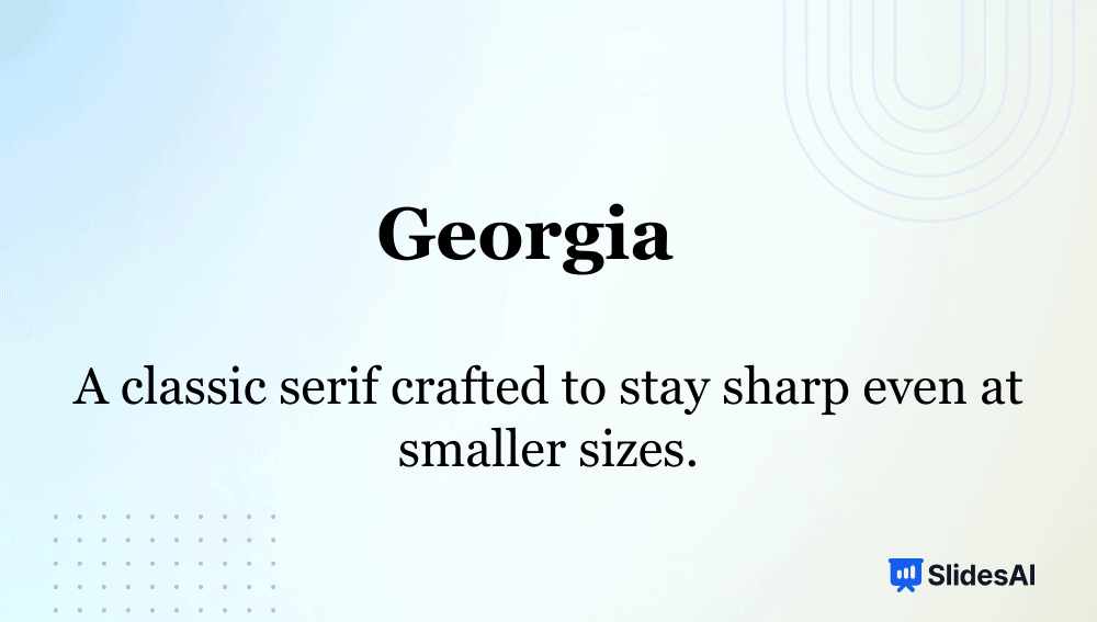
Intro: Georgia was built for on-screen reading, offering classic proportions with high contrast.
Why it’s among the best fonts for presentations:
- Maintains sharpness even on low-resolution screens.
- Works perfectly for formal, text-heavy presentations.
- Conveys authority and clarity.
Typeface: Serif
-
Franklin Gothic

Intro: A bold American grotesque typeface often used in headlines and editorial design.
Why it’s among the best fonts for presentations:
- Commands attention for key messages.
- Clean lines make it ideal for section headers.
- Conveys strength and confidence in corporate slides.
Typeface: Sans-serif
-
Dosis
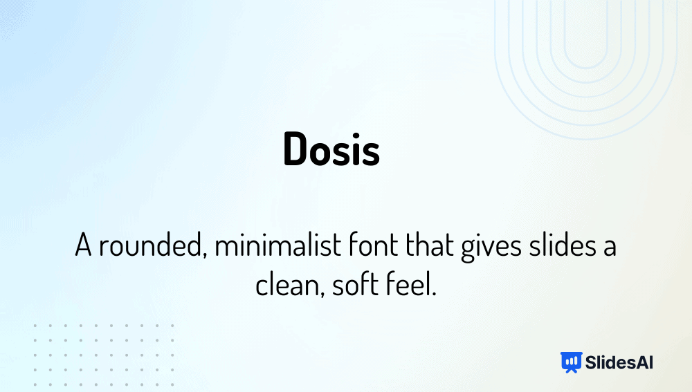
Intro: A geometric, rounded sans-serif font designed for friendliness and minimalism.
Why it’s among the best fonts for presentations:
- Perfect for creative, educational, or tech topics.
- Rounded forms feel modern and inviting.
- Simple lines keep slides uncluttered.
Typeface: Sans-serif (Variable)
-
Muli
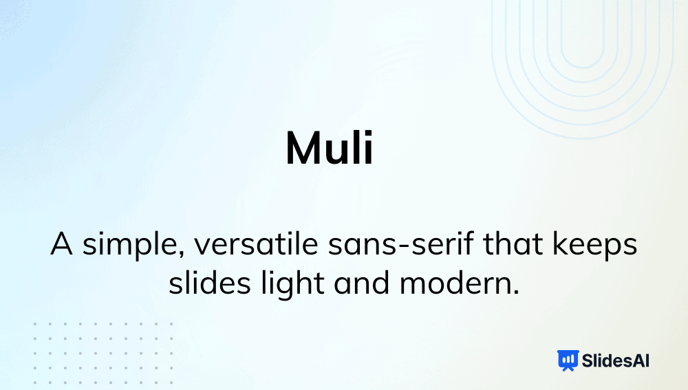
Intro: Muli (or Mulish) is a light, neutral sans-serif font with a minimalist tone.
Why it’s among the best fonts for presentations:
- Clean aesthetic for corporate or product decks.
- Works well as body text paired with bold headers.
- Maintains clarity even in condensed layouts.
Typeface: Sans-serif
-
Baskerville
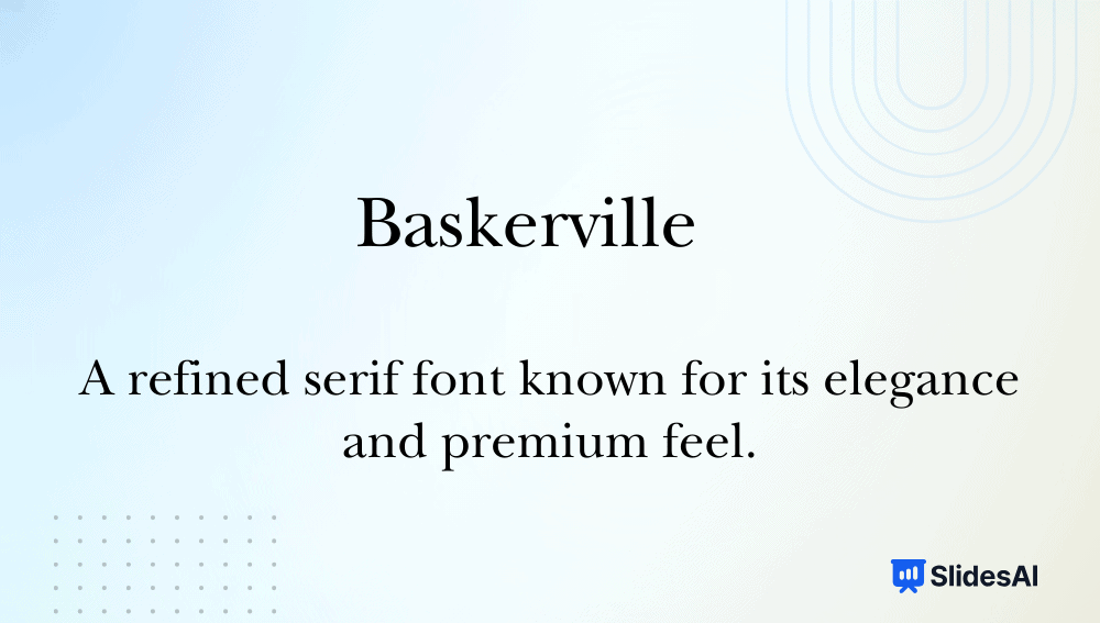
Intro: A transitional serif font that introduced greater contrast and refinement in letterforms.
Why it’s among the best fonts for presentations:
- Classic and formal, perfect for scholarly presentations.
- High contrast improves readability at larger sizes.
- Adds elegance and sophistication to professional decks.
Typeface: Serif
Fonts to Use for Headings vs Body Text
For headings, pick bold, modern, high-contrast fonts that grab attention. For body text, go for a font that is smooth, legible, and less stylized; such fonts maintain clarity and are easy to read.
Recommended Heading Fonts:
- Montserrat
- League Spartan
- Archivo Black
- Poppins, Roboto (bold)
- Lato (bold)
- Helvetica
- Franklin Gothic
- Avenir
- Playfair Display.
Recommended Body Fonts:
- Open Sans
- Inter
- Lato (regular)
- Roboto (regular)
- Verdana
- Calibri
- Tahoma
- Arial
- Source Sans Pro
- Noto Sans.
Best Font Pairing for PowerPoint Presentations
Font pairing is combining two fonts, one for headings and one for body text, to create visual balance and hierarchy. Here are the best fonts for a PPT presentation to make your slides look more professional:
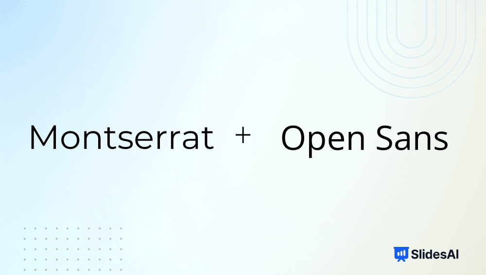
1. Montserrat + Open Sans: Minimal and business-friendly.
2. League Spartan + Lato: Confident headers with approachable body text.

3. Archivo Black + Inter: Ideal for educational decks.

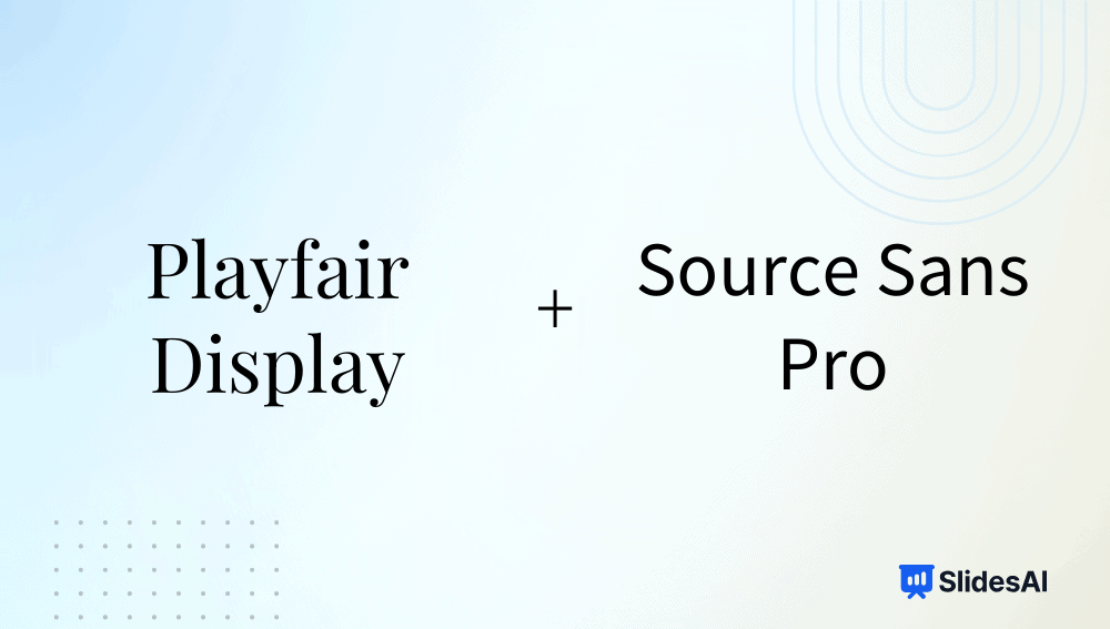
4. Playfair Display + Source Sans Pro: Great for creative and academic slides.
5. Poppins + Roboto: Modern and balanced for startups.

6. Franklin Gothic + Calibri: Corporate and reliable.

7. Raleway + Noto Sans: Elegant yet readable.

8. Helvetica + Georgia: Formal contrast between sans-serif and serif.

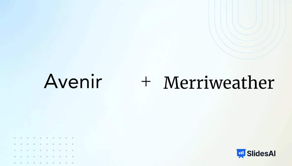
9. Avenir + Merriweather: Sleek yet warm for keynotes.
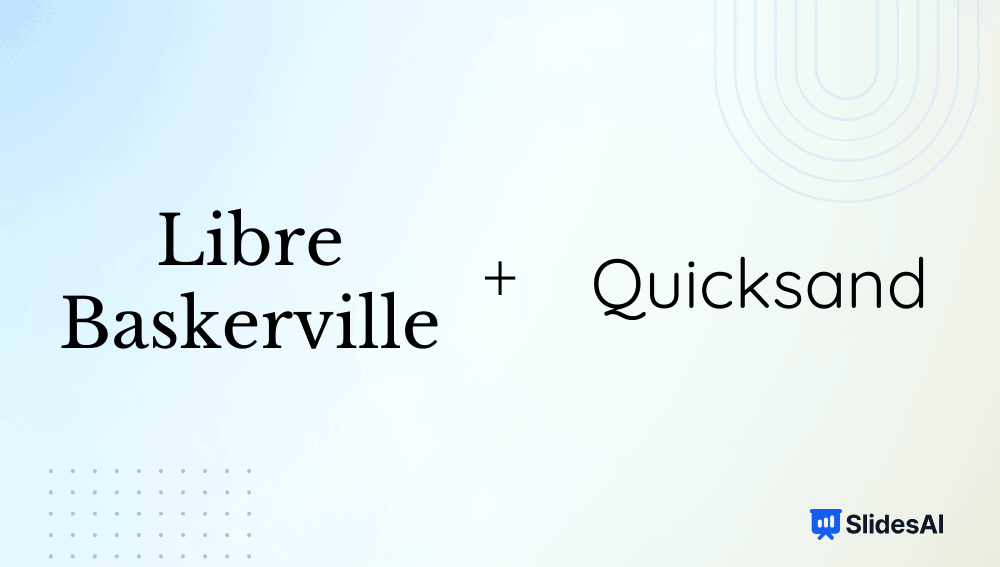
10. Libre Baskerville + Quicksand: Perfect blend of tradition and creativity.
How to Add Fonts to PowerPoint?
- Step 1: Download the font you want to use from a trusted source (e.g., Google Fonts, DaFont, or Font Squirrel).
- Step 2: Unzip the downloaded file if it’s in a .zip folder.
- Step 3: Double-click the .ttf or .otf file and click Install (on Windows) or Install Font (on Mac).
- Step 4: Once installed, restart PowerPoint if it’s already open.
- Step 5: Open your presentation and go to the Home tab → Font dropdown.
- Step 6: Locate your newly added font in the list and apply it to your text.
(Tip: If you plan to share the presentation, choose “Embed fonts in the file” under File → Options → Save → Font Embedding to ensure others see it correctly.)
How to Add Fonts to Google Slides?
- Step 1: Open a presentation in Google Slides.
- Step 2: Click on the Font dropdown menu in the toolbar.
- Step 3: Select More Fonts at the top of the font list.
- Step 4: In the pop-up window, search or browse fonts by category, popularity, or language.
- Step 5: Click the font name(s) you want to add — they’ll appear in the “My Fonts” list on the right.
- Step 6: Click OK, and your new fonts will now appear in your main font menu.
(Note: Google Slides only supports fonts available in Google Fonts — you can’t install local fonts directly.)
<SlidesAICTA1 />
How to Make the Right Font Choice for PowerPoint
To add value to your PPT, you need to pick the best font for presentation slides. Keep the following tips in mind when selecting a font for your slides:
- Understand the Font Types: Know the difference between serif, sans-serif, and display fonts.
- Pick Readable Sizes: Maintain at least 24pt for body text and 32-44pt for headings.
- Use Strategic Font Pairings: Create hierarchy without clutter.
- Ensure Strong Contrast: Light background? Use dark fonts, and vice versa.
- Keep Text Effects Minimal: Shadows or outlines should enhance, not distract.
- Limit to Two Fonts: Consistency improves design flow.
- Test on All Devices: Ensure your fonts display properly on shared files.
Best Fonts by Industry
Different industries demand different visual tones. Below are some of the best fonts for presentations for each of these industries:
- Technology & Startups: Montserrat, Roboto, Helvetica, Avenir, Poppins
- Finance & Legal: Georgia, Libre Baskerville, Merriweather, Lora
- Creative & Marketing: Raleway, League Spartan, Playfair Display, Poppins
- Healthcare & Education: Arial, Calibri, Lato, Open Sans, Inter, Nunito
- Corporate: Franklin Gothic, Helvetica, Arial, Calibri
- Academic & Research: Playfair Display, Inter, Georgia, Source Sans Pro
- Events & Nonprofits: Nunito, Quicksand, Lato, Open Sans
Save Time with SlidesAI
With SlidesAI, you don’t have to worry about font pairing or layout design. Its AI automatically selects the best font for presentation slides with modern fonts, aligns the text beautifully, and generates presentation slides in seconds, directly within Google Slides or PowerPoint. You focus on ideas; SlidesAI takes care of design.
Fonts may seem small, but they’re the foundation of every great presentation. The best fonts for presentations aren’t just about looks; they grab the audience’s attention, convey emotion, and build trust. Choose the best font for presentation that matches your purpose, keep readability front and center, and let SlidesAI help you craft beautiful slides effortlessly.
<SlidesAICTA1 />
Frequently Asked Questions
1. What is Typeface?
A typeface is a family of fonts sharing common design features, like Arial or Times New Roman.
2. What Are the Different Types of Typefaces?
The main types are serif, sans-serif, display, and script.
3. What Is the Difference Between Typeface and Font?
A typeface is the overall design (e.g., Helvetica), while a font is a specific variation (Helvetica Bold 16pt).
4. Which Fonts Should You Avoid in Professional Presentations?
Avoid Comic Sans, Papyrus, and overly decorative or script fonts that reduce clarity.
5. What Are the Best Fonts for Presentation Headings?
Montserrat, League Spartan, Archivo Black, and Franklin Gothic are excellent choices.
by
Tags:
