Most presentations fail for one simple reason. They feel predictable. Same layouts, same bullet points, same delivery. After a few slides, people stop paying attention.
In this blog, we are going to look at how you can plan and design presentations that actually hold interest. You will find simple ways to structure your content, improve your slides, and make your message land better.
How to Plan a Creative Presentation
A creative presentation does not begin with design. It starts with planning. Before you think about fonts, images, or transitions, you need to know what you want your audience to take away.
Here is how you can plan your presentation in the right way:
1. Start by Understanding Your Audience
Before creating slides, think about who will be watching your presentation.
A classroom presentation will look very different from a business pitch. A presentation for clients may need a professional tone, while a presentation for students may need more visuals and interaction.
Ask yourself:
- What does the audience already know?
- What information will matter most to them?
- How long can they realistically stay focused?
- What type of examples will connect with them?
When you understand your audience first, your slides become easier to shape around their interests.
2. Decide on One Clear Message
Many presentations lose focus because they try to cover too much.
Instead of explaining ten different ideas, choose one central message. Think about the main takeaway you want people to remember after the presentation ends.
For example:
- A sales presentation may focus on solving a customer problem.
- A school presentation may explain one topic clearly.
- A company update may focus on progress and future goals.
Having one clear message keeps your slides organized and prevents information overload.
3. Pick a Visual Direction Early
Creative presentations feel consistent because they follow a clear style.
Before building slides, decide on a visual tone. This includes:
- Color palette
- Font style
- Image type
- Layout style
- Overall mood
For example, a modern business presentation may use clean layouts with neutral colors. A creative portfolio presentation may use bold typography and large visuals.
Choosing your visual direction early helps avoid slides that look disconnected from one another.
4. Create a Rough Structure Before Designing
Many people open presentation software and start designing immediately. This usually leads to messy slides.
Instead, build a simple outline first.
You can structure your presentation like this:
- Introduction
- Problem or topic
- Supporting points
- Examples or visuals
- Conclusion
- Final takeaway
Once your structure is clear, creating slides becomes much easier.
5. Focus on One Idea Per Slide
Crowded slides are difficult to follow.
Each slide should communicate one clear idea. If you try to explain multiple concepts at once, your audience may lose focus.
A clean slide often works better than a slide packed with text.
Think of slides as visual support rather than full paragraphs.
Also Read : Funny PowerPoint Night Ideas
Creative Presentation Design Ideas
Now that planning is done, the next step is designing slides that feel engaging and easy to follow.
Let’s look at creative presentation ideas that can improve both appearance and audience attention.
1. Typography and Color Ideas That Improve Slide Impact
Text and color are often underestimated. They shape how your presentation feels.
a. Use Large Fonts to Highlight Important Information
Not every word deserves equal attention.
Use larger font sizes for:
- Headlines
- Numbers
- Quotes
- Statistics
- Important takeaways
When certain words appear larger, the audience naturally notices them first.
b. Keep Your Color Palette Simple
Using too many colors can make slides look chaotic.
A simple two-color combination often works best. It creates consistency without becoming distracting.
Examples include:
- Navy and white
- Black and beige
- Green and grey
- Blue and light cream
Simple color combinations make presentations look cleaner.
c. Match Colors to Emotion
Colors influence how information feels.
Here are some common associations:
- Blue often feels trustworthy and calm
- Yellow creates energy and positivity
- Red grabs attention and creates urgency
- Green feels balanced and fresh
Using color intentionally can make slides more meaningful.
d. Add Bright Colors as Accents
Bright colors work best when used selectively.
Instead of filling entire slides with strong colors, use them to highlight:
- Important numbers
- Call-to-action buttons
- Titles
- Charts or icons
This creates contrast without overwhelming the viewer.
2. Layout Ideas That Improve Slide Flow
Good layouts make presentations easier to understand.
a. Use Split Layouts for Comparisons
A side-by-side design works well when comparing information.
You can use this layout for:
- Before and after examples
- Product comparisons
- Pros and cons
- Old vs new solutions
This structure keeps information balanced and easy to scan.
b. Add Timelines to Show Progress
Timelines work well when explaining:
- Business growth
- Historical events
- Project stages
- Company milestones
Instead of listing dates in bullet points, timelines make information easier to follow visually.
c. Leave Empty Space on Purpose
Many people feel the need to fill every corner of a slide.
But empty space improves readability.
White space helps separate information and makes slides feel less crowded.
A slide with fewer elements often feels more professional.
d. Include a Navigation Slide for Long Presentations
For longer presentations, a table of contents slide helps people understand what is coming next.
It also gives structure to the presentation.
This works especially well for:
- Workshops
- Business reports
- Educational sessions
- Client presentations
3. Engagement Ideas That Keep People Listening
Creative presentations are not just visual. They involve interaction.
a. Begin With a Strong Opening Question
Questions immediately grab attention.
Instead of starting with a plain title slide, ask something meaningful.
For example:
- What makes people remember a presentation?
- Why do most slides fail to hold attention?
- What problem are we trying to solve?
Questions encourage people to think.
b. Break Long Sessions With Interaction
Long presentations can become tiring.
Add moments where the audience participates.
You can include:
- Quick polls
- Short discussion slides
- Reflection questions
- Small audience tasks
These pauses help reset attention.
c. Use Storytelling to Guide Information
People connect with stories more easily than facts alone.
A simple storytelling structure works well:
- Introduce the situation
- Explain the challenge
- Present the solution
- Share the result
This format keeps presentations flowing naturally.
d. Add Scenarios to Explain Complex Topics
Sometimes information feels too technical.
Instead of explaining theory, use realistic situations.
For example:
- Customer examples
- Workplace situations
- Classroom examples
- Case studies
Scenarios make ideas easier to understand.
e. Finish With a Clear Next Step
The final slide matters more than most people realize.
Avoid ending with a plain “Thank You” slide.
Instead, include:
- A summary
- A final message
- Contact information
- Next steps
- A question for discussion
A strong ending helps people remember your presentation.
4. Visual Ideas That Make Slides More Interesting
Visuals help people process information faster.
a. Replace Heavy Text With Infographics
Large blocks of text can feel overwhelming.
Infographics turn information into something easier to understand.
You can use them for:
- Statistics
- Processes
- Comparisons
- Step-by-step explanations
b. Add Short Videos When Needed
Videos break repetition.
A short clip can explain something faster than multiple slides.
Keep videos short so they support the presentation rather than interrupt it.
c. Use Motion Carefully
Animations can improve presentations when used correctly.
Simple transitions help slides feel smoother.
Too many effects may feel distracting.
Subtle movement usually works best.
d. Keep Icons Consistent
Icons improve visual clarity.
Use one consistent icon style throughout the presentation.
This creates a polished appearance.
e. Choose Authentic Visuals
Generic stock images often feel disconnected.
Instead, use:
- Real screenshots
- Original graphics
- Branded visuals
- Themed illustrations
Relevant visuals create stronger engagement.
5. Choose Template Styles That Match Your Presentation
Templates help shape the mood of your slides.
Different topics work better with different styles.
a. Minimalist Style
Minimalist templates focus on clean layouts and limited distractions.
They work well for professional settings.
b. Contemporary Style
Modern templates often include smooth layouts, bold sections, and updated typography.
These fit business presentations and startup pitches.
c. Fun and Relaxed Style
For informal topics, a lighter presentation style works well.
This approach feels approachable and friendly.
d. Playful Templates
Playful layouts often include illustrations, rounded shapes, and soft colors.
These work well for children, education, or creative industries.
e. Geometric Designs
Shapes and structured layouts create a polished look.
Geometric templates work well for modern topics.
f. Black and White Presentations
Simple monochrome themes create a clean and timeless feel.
They help keep attention on content rather than decoration.
g. Photo-Focused Slides
Image-heavy templates work well for storytelling and portfolios.
They allow visuals to lead the presentation.
h. Bright and Colorful Themes
Strong colors can create energy when used correctly.
These templates work well for creative presentations or workshops.
Browse our presentation templates to find a design that matches your topic and audience.
How to Create Creative Presentations Faster with SlidesAI
Creating presentations from scratch takes time.
Tools like SlidesAI help simplify the process while still allowing room for customization.
Here is how you can create presentations faster using SlidesAI:
1. Open Google Slides
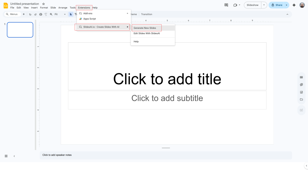
Start a new presentation or open an existing one inside Google Slides.
You can launch SlidesAI from the Extensions menu.
2. Select How You Want to Build Slides
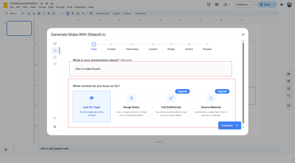
SlidesAI gives you multiple ways to start.
You can create slides from:
- A topic
- Existing text
- Notes
- Structured content
This flexibility makes it easier to work with what you already have.
3. Enter Presentation Details
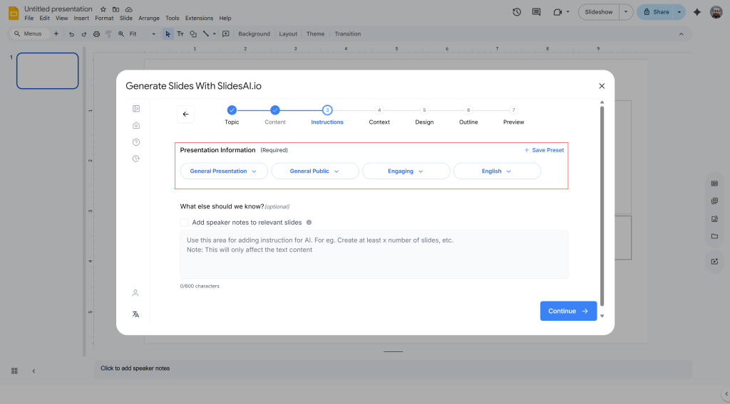
Instead of writing complicated prompts, SlidesAI asks for information like:
- Topic
- Audience
- Purpose
- Style preference
- Content focus
This makes the process more guided.
4. Choose Design Preferences
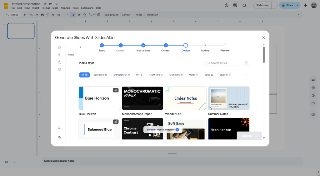
You can decide:
- Number of slides
- Theme style
- Layout
- Colors
- Presentation tone
These settings shape the final output.
5. Generate Slides Quickly
SlidesAI organizes your content into sections and automatically creates slides inside Google Slides.
This saves time during the early drafting stage.
6. Edit and Finalize
Once the slides are created, you can customize them.
You may want to:
- Adjust text
- Replace visuals
- Add branding
- Improve layouts
- Rearrange sections
This step gives your presentation a more personal touch.
<SlidesAICTA1 />
Closing Thoughts
Creative presentations are not about adding flashy effects or complicated designs. They work because they are clear, visually balanced, and easier to follow.
When you combine strong planning, thoughtful layouts, meaningful visuals, and audience interaction, presentations become more memorable.
The goal is not to impress people with decoration. The goal is to make information easier to understand and harder to forget.
Related Posts
-

Presentation aids are tools that speakers use alongside their words and delivery to help get…
-

A great webinar presentation is more than just slides; it’s a powerful storytelling tool that…
-

How do you grab your audience’s attention the moment you step into the spotlight? The…
-

If you want your PowerPoint slides to play continuously without manual clicks, you can enable…
-

presentation? A survey results presentation is a structured way of displaying and explaining the findings…